Design System V4
The redesign of the DataGalaxy V4 Design System responds to a strategic need to unify and structure the interface components.
The main objective was to create a solid, consistent and scalable foundation to support the product's growth while ensuring accessibility and consistency between the tech and product teams.
-
The existing Design System shows limitations that affect consistency and efficiency in product development. Documentation gaps and lack of alignment between Product (designers) and Tech (developers) teams can lead to inconsistencies and slower delivery.
-
Lack of token architecture
Inadequate documentation and Lack of guidelines
Operational consequences

Implemented solution
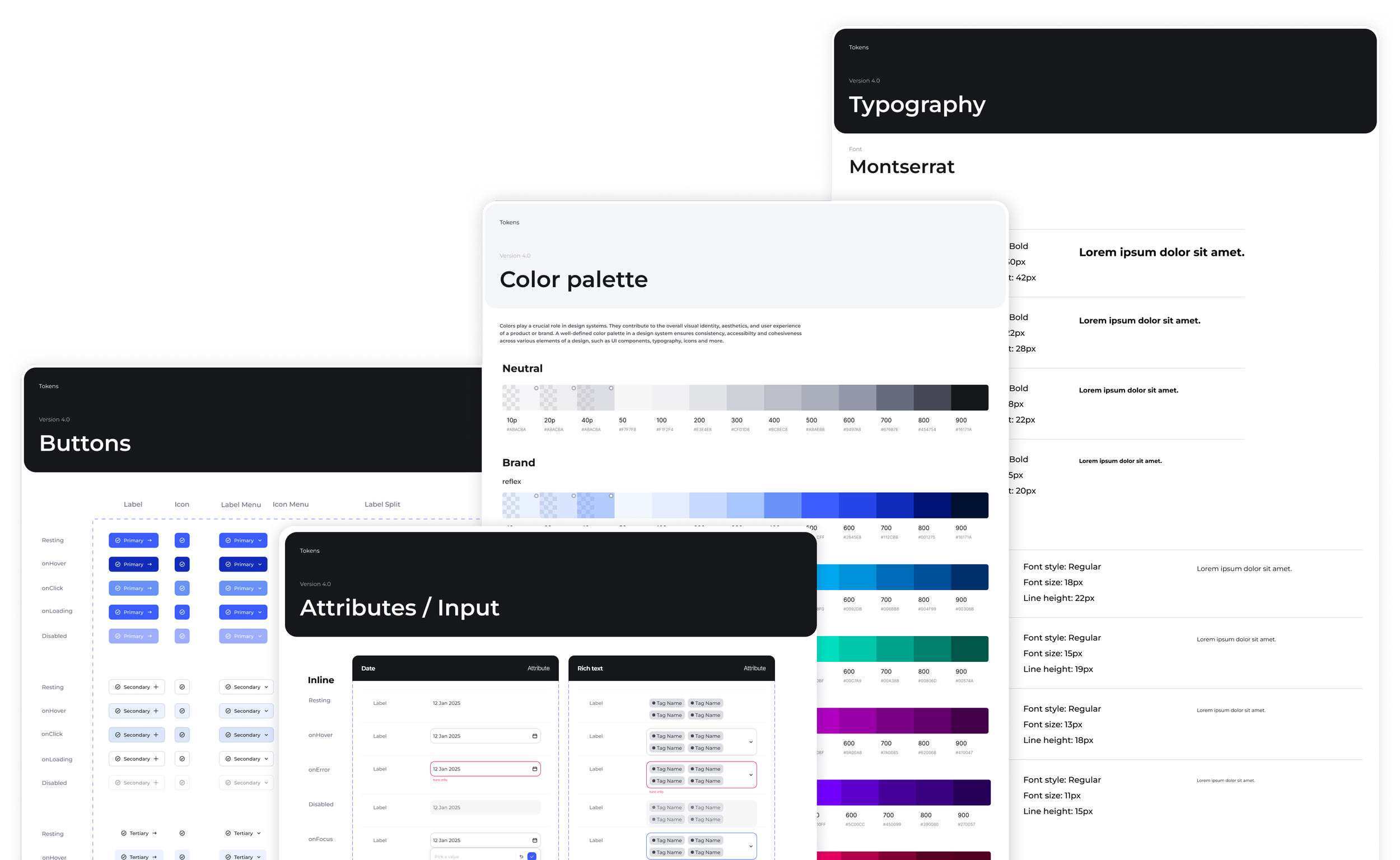
1. Three-level token architecture
We introduced a structured token architecture, based on an advanced approach, to create a shared foundation between design and development, improve consistency, and make the system easier to scale over time.
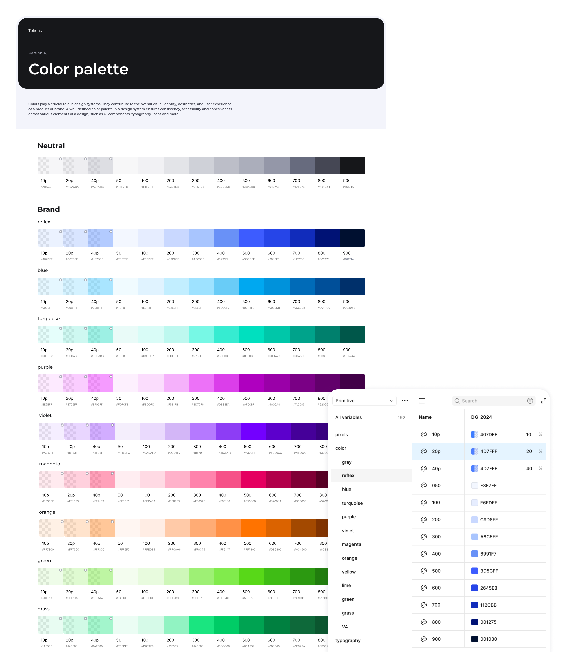
Primitive tokens
Basic, atomic and contextual values(eg, Raw colors / Pixels / Typography)
Semantic Basic
Tokens with business, referencing primitives (eg, Color / Radius / Padding / Gap)
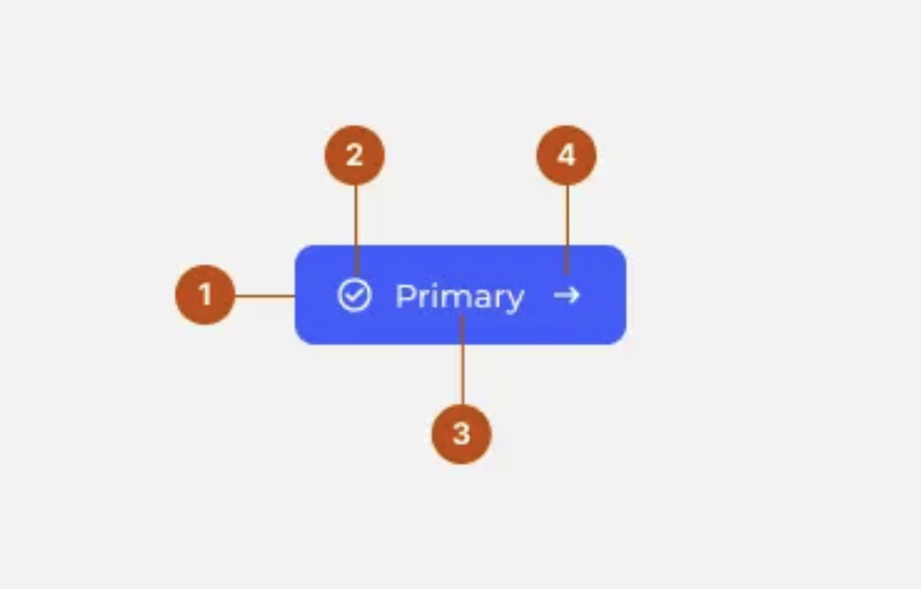
Component tokens
Tokens specific to each component (eg, Buttons / Checkboxes / Input / Filter / Tags / Tabs)
Advantages of this approach
Maximum flexibility
Simplified maintenance
Cascading changes
Consistent quality
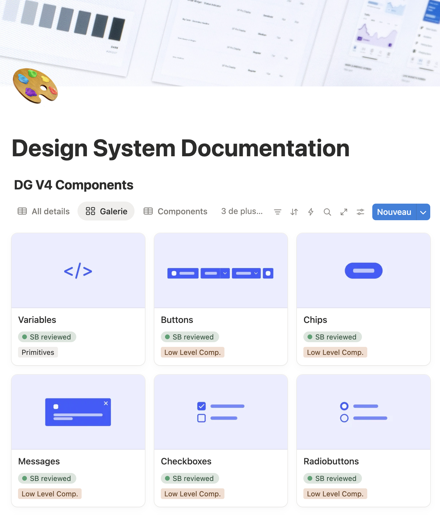
2. Complete technical documentation in Notion
We have created a Design System Hub that centralises all technical documentation, structured according to developers' needs.
Component documentation structure
Technical specifications
Variants and states
Usage guidelines
Behaviour
3. Optimised collaboration workflow
We have established a clear process for integrating new components:
Assess the need (reusable component or one-time use)
Check existing solutions and prioritize adaptation
Validate the creation with the design team (consistency, value, reusability)
Document the component
Add it to the backlog
Develop and validate before deployment

Benefits of this workflow
Zero ambiguity
Figma file always up to date
Guaranteed quality
Fewer back-and-forths
Shared knowledge
Keep reading
More examples of design that drives results.