New Data Catalog
The New Data Catalog project involved a complete overhaul of the data catalogue interface (DataGalaxy) and navigation bar.
Goal
The main objective was to simplify search, improve personalisation and strengthen data governance through a user-centred interface that is more intuitive, adaptable and geared towards workflow efficiency.
-
The redesign of the Data Catalogue is a natural next step following the redesign of the design system, aiming to provide a consistent, intuitive and personalised user experience across the entire platform.
The existing catalogue suffered from complex navigation, unclear data structuring, poorly positioned sidebars and an imprecise search function, which caused a great deal of frustration. These limitations hindered adoption by business teams, who perceived the task as unproductive and time-consuming, reducing engagement and completion of the catalogue.
-
Complexity and inconsistency of navigation compared to the rest of the new design system
Essential information in the header is difficult to see due to poor responsiveness
Poor structure and insufficient readability of key data attributes
Low business adoption due to the perception of low value-added and highly technical tasks
Poorly targeted search with irrelevant results and information overload

How might we …
Improve the responsiveness of the Data Catalogue while making information more visible and better structured to facilitate users' daily tasks?
UI Phase
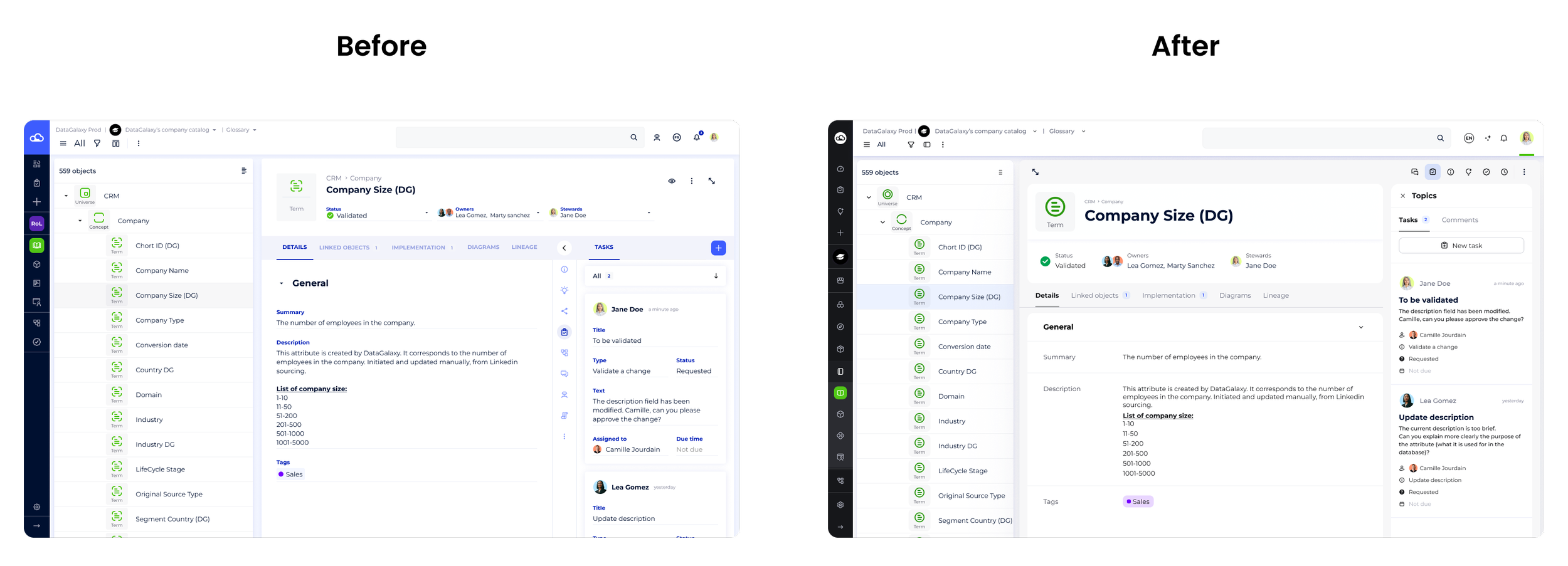
The redesign of the Data Catalogue UI interface focused on several key areas, which can be seen in the before/after images. Our goal was to create a consistent, lightweight interface in line with the new design system, to make information easier to read and manage in the demanding context of data governance.
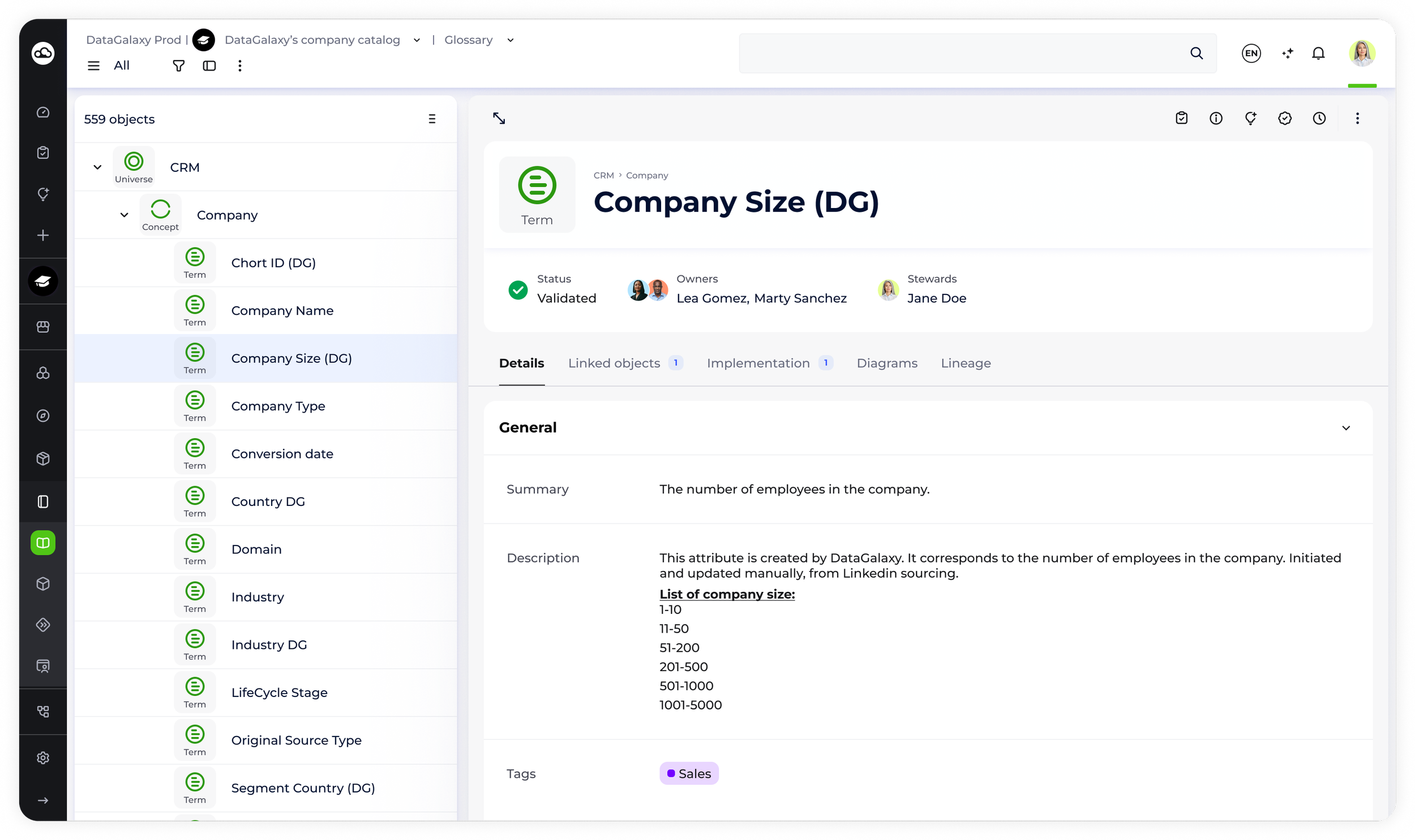
Structure and clarity of assets
The asset page, which was previously overloaded, has been restructured to clearly separate the different areas: header, fields, tabs, asset panel, bar panel.
The primary components (title, logo, status, owners, stewards) are highlighted in the header, providing immediate access to key information even on small screens thanks to breakpoints and adaptive display (stacked or in line depending on size).
The fields are now organised into distinct sets. Each block of fields forms a card with separators, which improves readability and makes it easier to read in a dense environment.
Responsiveness was a priority: the display adapts intelligently to maximise the visibility of key attributes, whether primary or secondary, without sacrificing usability.
Reorganisation of interactive elements and navigation
The panel bar, previously vertical and next to the fields, has been repositioned above the header with a horizontal layout: it groups together the main modules (tasks & comments, AI suggestions, campaigns, activity log, more options, etc.) for quick and intuitive navigation, without encroaching on the main reading area.
When an insight is selected from the panel bar, the page increases in height and width, optimising the workspace without losing visibility.
Specific displays (e.g. tasks) have been redesigned: tasks and comments are grouped together and accessible via switchable tabs, reducing the number of clicks and clarifying the possible actions.
Integration and enhancement of new components
All interface icons have been redesigned to standardise the experience and make modules more recognisable and aesthetically pleasing.
New fields have been added, with two responsive display modes: ‘stacked’ for small screens and ‘in line’ for large screens, ensuring perfect adaptation to all devices.
Introduction of AI suggestions: the Data Asset page dynamically offers tags or recommendations for empty or partially filled fields, enriching the user experience.
The main navigation bar has been redesigned to accommodate new modules and clearly organise their sub-categories, facilitating exploration and access to the various resources in the catalogue.
User test
We decided to organise user tests with several of our existing customers, asking them to test the new interface.
Goal: The aim was to verify in practice whether the new design, intended to be more intuitive and consistent, really did make everyday use easier.
Participants carried out typical tasks on the new version of Data Catalog, then shared their impressions and difficulties in real-life situations. This format allowed us to gather authentic feedback on the ergonomics, fluidity and comprehensibility of the new features. The user feedback collected was used to identify the strengths of the design but also to prioritise remaining improvements, ensuring continuous adjustment of the interface according to needs.

Mousquetaire

It's cleaner, more minimalist, I like it. Having everything in one place is good, it means less back and forth on the screen, I like that.
All the elements are at the top right, which is standardised and clearer.
Manitou
After testing the prototype of the new Data Catalog interface with users, several key points emerged from the interviews:
Some users pointed out that the new organisation reduces the time needed to find relevant information and carry out their actions.
The interface is considered more intuitive and user-friendly, making it easier to navigate and customise views according to profiles.
The structure of the information is better perceived, with improved visibility of essential attributes and links between objects, making tasks easier to accomplish.
Responsiveness is appreciated, allowing for smooth use on different types of screens without loss of information.
The overall experience has increased user satisfaction and engagement with the product, confirming the relevance of the direction taken for the UX/UI redesign.
Improve responsiveness
Context and expected result
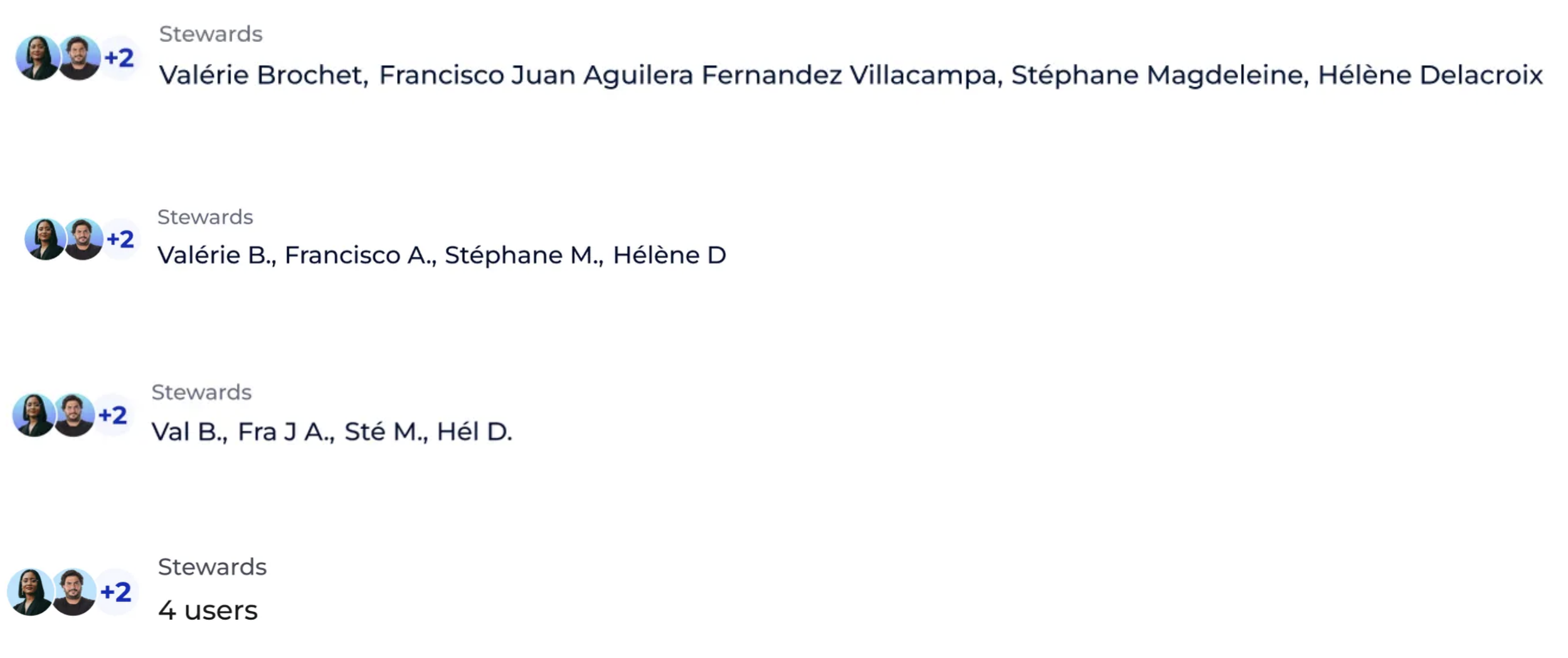
The object cards in our interface feature a header that groups together several key pieces of information (compact attributes), such as validation status, owners or administrators, associated tags, content quality, and links to other objects or domains.
Currently, a responsiveness issue means that even when space is available, the header only displays counters (e.g., “X users” or “4 values”) instead of displaying the full names of administrators, tags, or associated objects. This limitation results in a loss of information visible to the user and a waste of space on larger screens.
Expected result
The goal is to optimise the display of compact attributes in the header by defining breakpoints and adaptive visual rules. Thus, depending on the available width, the header can dynamically display the full names of administrators, tags, or associated objects, or switch to a compact display (counters) when space is insufficient.
This optimisation will improve readability, user experience, and space utilisation on all screen types.
User Compact attributes
Calculate total X Username and depending on whether the entire width of the input exceeds the available space, we branch off to First name N. then First name (3 characters) N. then when space is most limited Counters
Display mode:
Valérie Brochet
Valérie B.
Val (3 character) B.
Badge (counter)
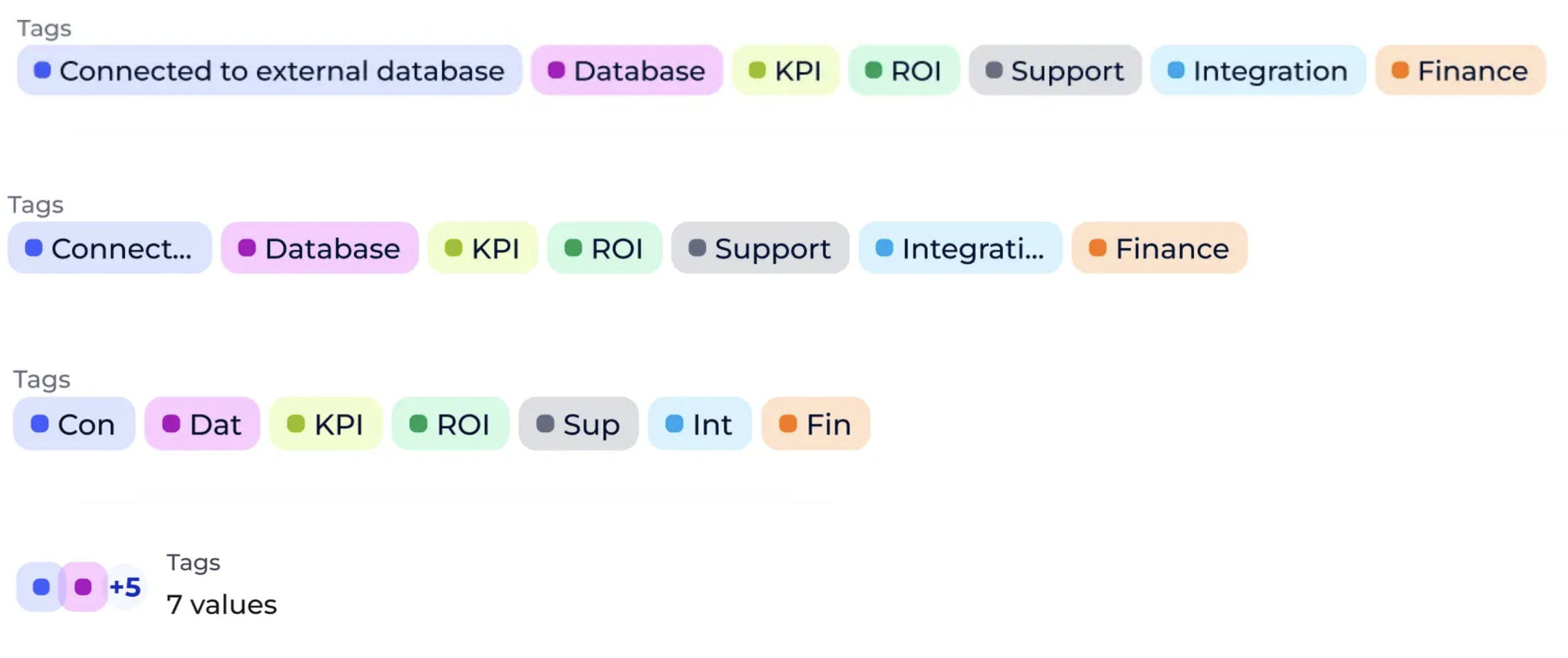
Tag Compact attributes
Badge mode:
There is not enough space to display the 3-character tags. (The available size divided by the number of tags is smaller than 50px example.
Display mode:
Full tag title “Governance”
Tags ellipse “Govern…”
First 3 characters of the tag “Gov”
Badge (counter)
Object Compact attributes
Set a minimum width per object (eg 80px). Below a certain size, you switch to Badge mode.
Display mode:
Full object title
Ellipse the object title (...) down to its defined minimum width
Badge (counter)


Analyze impact
The UI V4 redesign marked a real change. Business usage and engagement are up significantly, operational efficiency has improved, and searching and task completion are now more fluid. Advanced responsiveness ensures optimal display, whether for primary information (title, owner) or secondary information (tags, AI suggestions, activity tracking).
These indicators confirm that user-centred design, simplification and data structuring create real business value and promote long-term adoption.
Keep reading
More examples of design that drives results.