New FAQ & Internal Knowledge Base
The project involves redesigning two areas: an internal knowledge base for employees/advisors and a customer FAQ section, in order to make information more accessible, more prominent, and easier to maintain. The overall goal is to improve service quality (customer and internal support), reduce friction when searching for information, and strengthen knowledge sharing within the company.
Goal
Create a unified help center, consisting of an internal knowledge base and a public FAQ, with clear navigation by role (advisors, employees, customers) and by topic
Offer powerful search and guided paths so that each profile can quickly find the information relevant to their context
Highlight key content via editorial blocks
-
Internally, the existing knowledge base was poorly structured, with content that was difficult to find and rarely updated, forcing advisors and employees to seek help directly from their colleagues or expert teams.
On the customer side, the FAQ did not include new product features and had outdated ergonomics, resulting in lengthy searches, multiple entries for the same question, and a high volume of support tickets.
The main UX challenge was to make access to information much faster and more intuitive, in order to help teams respond accurately and enable customers to easily troubleshoot themselves + allow the FAQ to be customized according to customer preferences.

How might we …
Create a unique knowledge experience that helps advisors, employees, and customers find answers faster?
Internal knowledge base
UX process
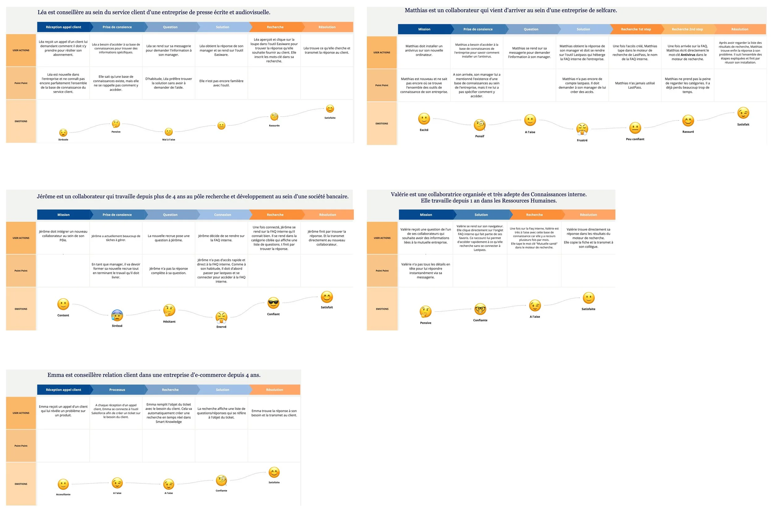
User research
Quick internal interviews with Smart Tribune employees (advisors, account managers, R&D, HR, marketing, etc.) to understand their daily tasks and how they currently search for information.
Identification of common problems: scattered content, difficulty knowing where to start, lack of confidence in updating articles.
User journeys & mapping
For each persona, definition of a typical journey “from question to answer” (e.g., an advisor receives a call, searches for a procedure, shares it with the customer).
Mapping of key steps, friction points (search time, tool changes, broken links), and associated emotions to prioritize areas for simplification.
UI process
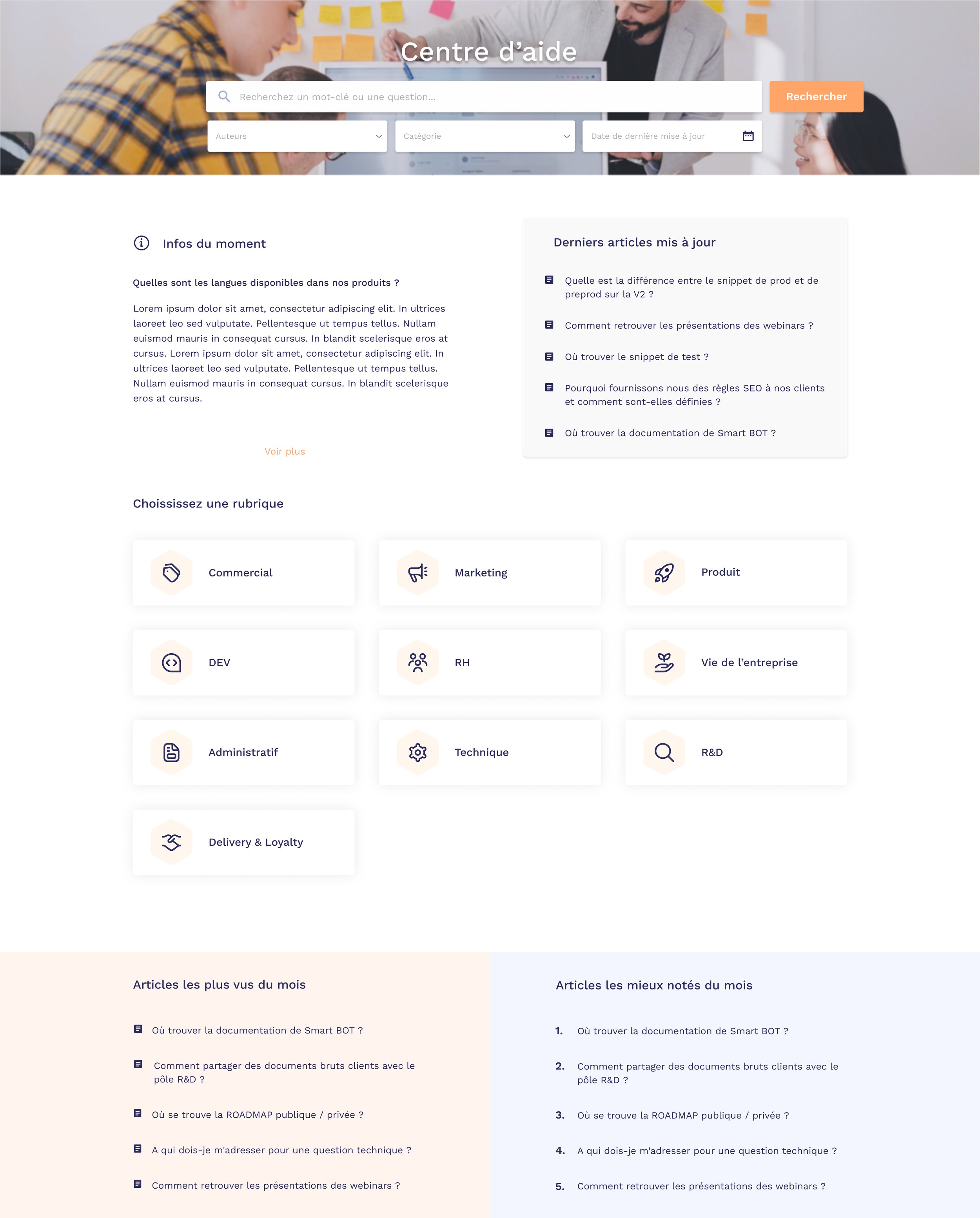
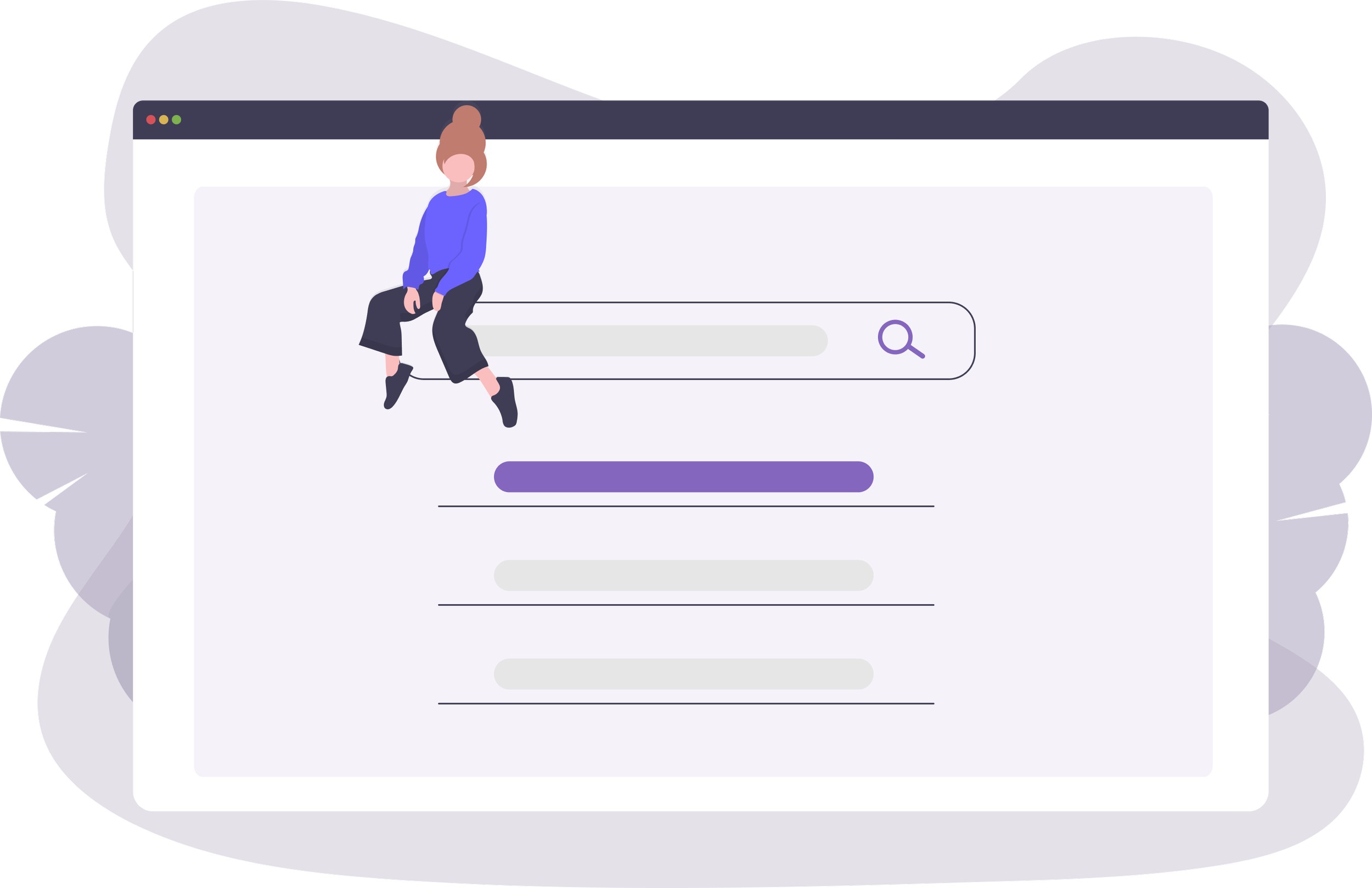
Internal home page
Design of a home page focused on search (search field + filters) and highlighting key content:
Latest news
Latest articles
Most viewed
Top rated
Use of clear cards for sections, consistent icons, and soft colors to differentiate spaces without visual overload.
Smart Tribune customer FAQs
UX process
Information architecture
Three-level hierarchical organization:
main categories (Onboarding, Content, SEO, Translation, Integration, Performance Tracking)
Expandable subcategories
Sub-subcategories for fine granularity
Contextual navigation with breadcrumb trail system for easy navigation within the tree structure
Reclassification of questions/articles by functional themes rather than internal logic
Analysis of existing content & customer feedback
Review of old FAQ pages, search statistics, and support tickets to identify the most frequently viewed topics and search terms.
Identification of problems:
Unclear navigation
Lack of promotion of new features
Difficulty following a logical path
Optimization of discoverability
Highlighting “Current news” on the homepage to promote new content or important alerts
“Most viewed questions” section based on analytics to facilitate access to popular content
Suggested search examples (“Installation,” “Project management,” “Translation”) to guide users
Category tagging system (Content, New) with color coding (orange) to quickly identify article type
UI process
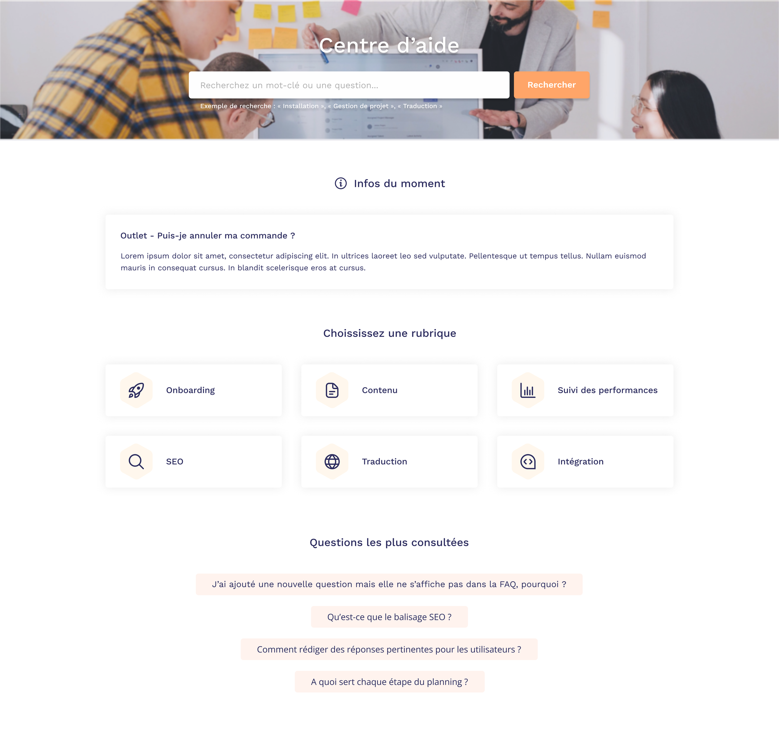
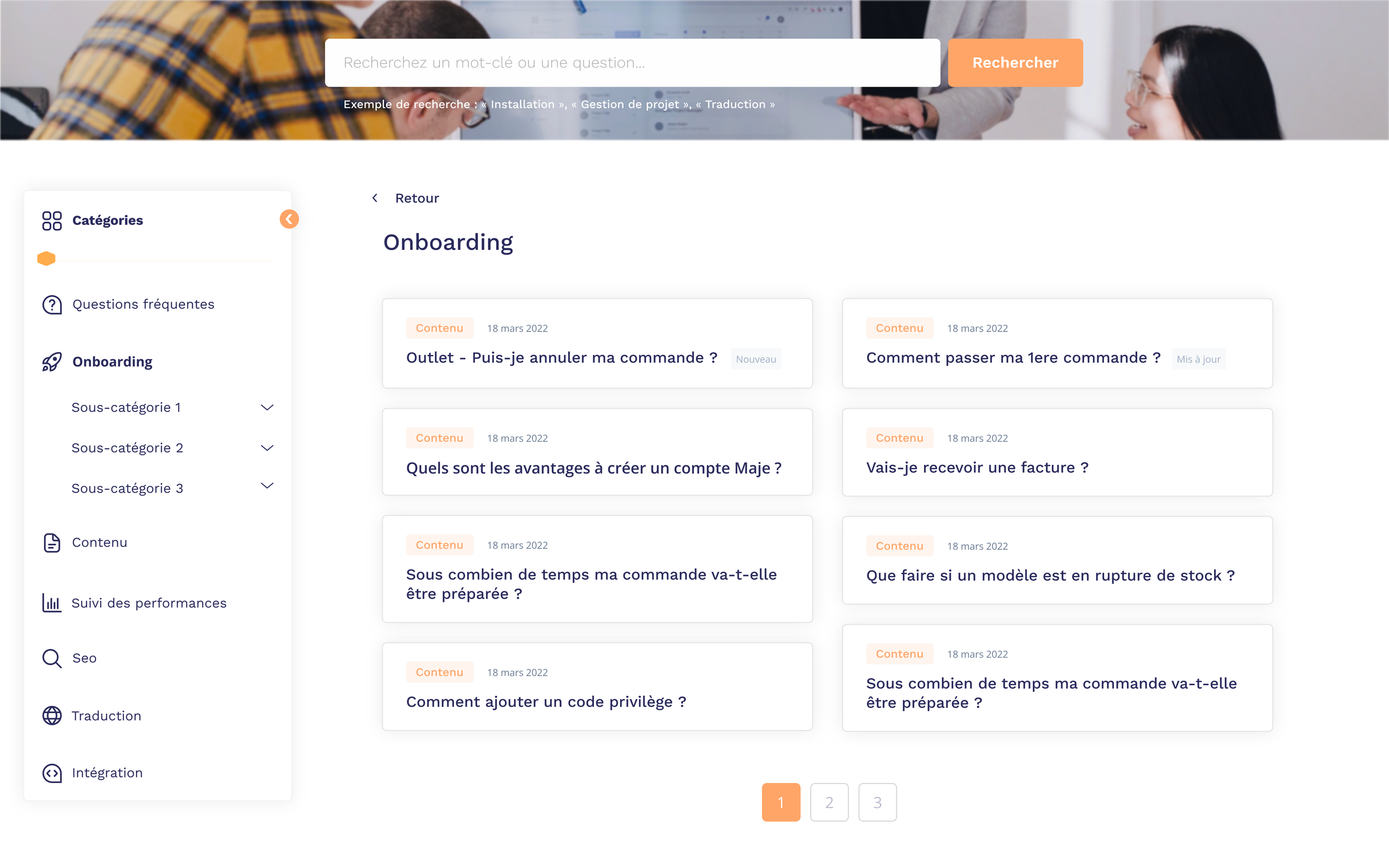
Home page (FAQ)
Immersive header with background image and centered “Help Center” title for immediate identification
Prominent search bar with placeholder “Search for a keyword or question” and primary “Search” button
Clickable search examples below the bar to reduce friction
“Current info” section with featured card containing the latest news
Grid of main categories under “Choose a topic” organized into cards with icons, labels, and light background on hover
Footer with “Most viewed questions” section listing 4 popular questions in clickable cards
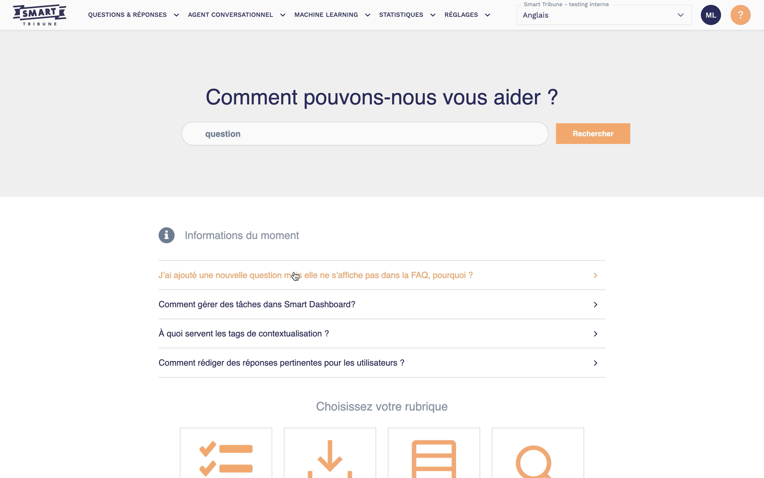
BEFORE
AFTER
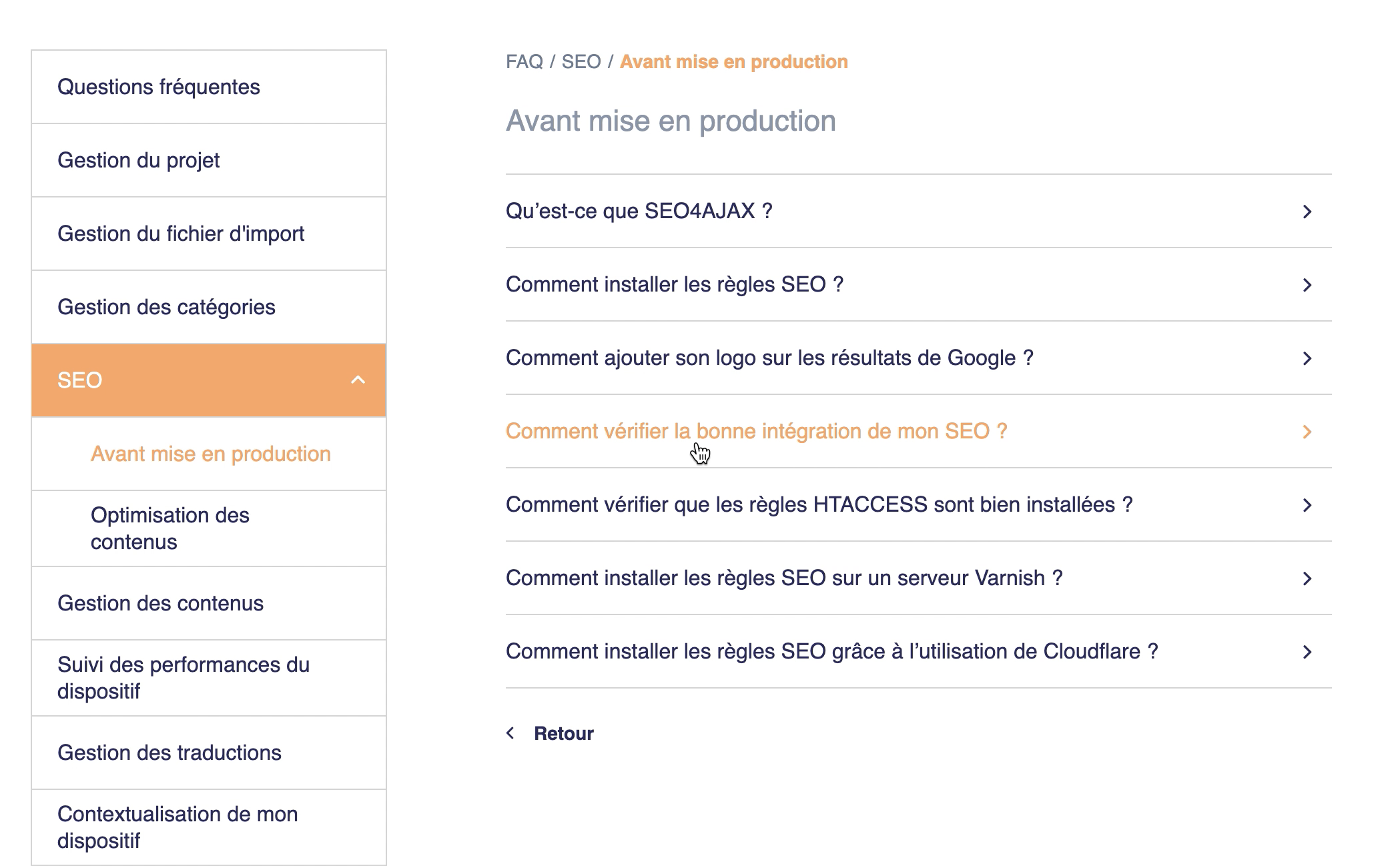
Results page (FAQ)
Fixed side navigation displaying all categories with visual indicator (orange dot) of the number of items
Active category (Onboarding) with expandable subcategories via chevrons
Breadcrumb system “< Back” at the top of the main content
Creating a responsive side menu with animated drop-down menus: allowing users to choose how to manage their space and optimize their reading of the results displayed.
Item card grid (2 columns) with category tag, publication date, title, and “New” or “Updated” badges
Pagination at the bottom of the page for long listings
BEFORE
AFTER
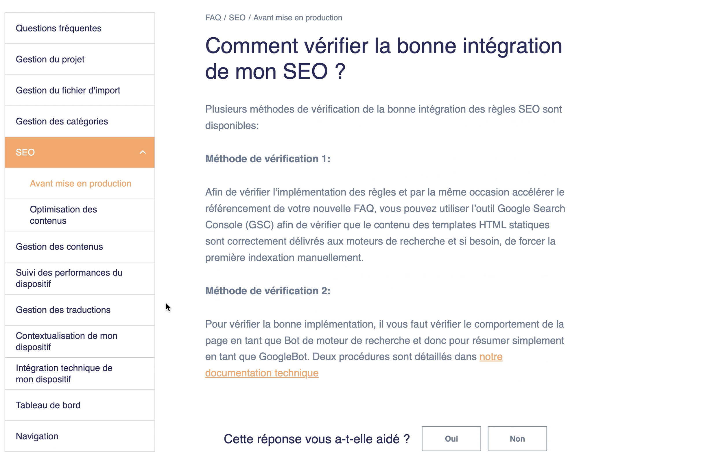
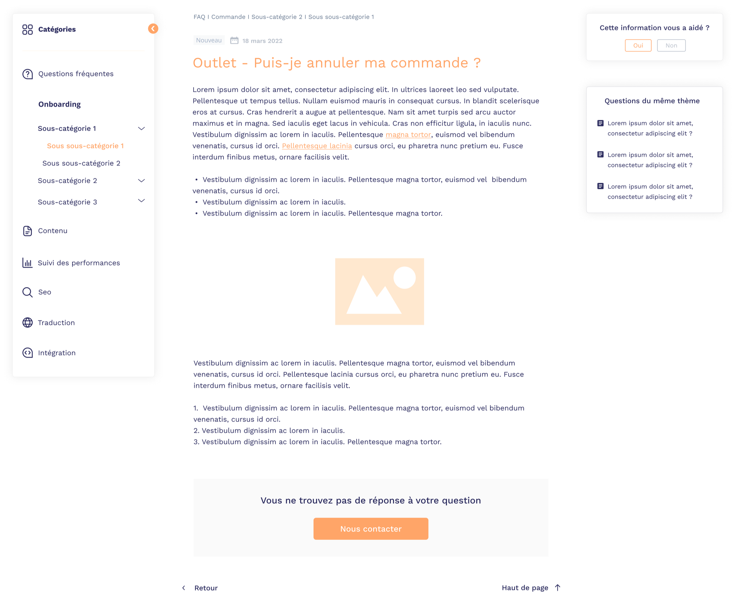
Home page FAQ (Help Center)
Main content
Addition of a “New” or ‘Updated’ badge and the date “March 18, 2022” at the top of the article to provide readers with more information
Option to add images or videos to illustrate the answer (e.g., visual tutorials)
Side navigation and space management
Responsive left side menu with animated drop-down menu system (expansion/collapse arrows) allowing users to choose their level of detail: compact view with main categories closed or full view with subcategories visible
Visual affordance with smooth animation when opening/closing submenus for a better understanding of the hierarchy
Optimization of reading space: users can collapse irrelevant categories to maximize the main content area
Sticky right sidebar (fixed position when scrolling)
Customer satisfaction section that remain visible at all times when scrolling to allow for immediate feedback, even on long articles
“Related questions” section displaying three similar clickable questions, also in a sticky position, to encourage cross-navigation without interrupting reading
This fixed sidebar ensures that engagement options (feedback and related navigation) always remain in the user's field of vision, which is particularly useful for long answers that require significant scrolling
Article footer
“Contact us” call-to-action for unresolved cases
“Back” navigation to return to the list and “Top of page” to quickly scroll back up long content
BEFORE
AFTER
Analyze impact
Increased adoption
of the internal knowledge base (more visits to business sections and “Current Info” sections) and improved quality of feedback from teams, who now perceive the tool as a true shared workspace rather than a simple document repository.
Reduction in the average time
spent searching for an internal article by advisors/employees, thanks to the new information architecture, filtered search, and shortcuts to critical content.
Decrease number of simple tickets
sent to customer support, as users are better able to find answers in the new FAQ, particularly regarding new features.
Keep reading
More examples of design that drives results.