
Machine Learning
The Machine Learning project aims to develop a content recommendation engine for back office users, allowing them to choose precisely which content to activate or hide in suggestions associated with a given piece of content.
Goal
The main objective is to improve the personalisation of recommendations by offering granular control to administrators, thus avoiding irrelevant suggestions that could detract from the user experience.
-
In the back office of a content management platform, teams found that automated recommendations lacked flexibility, resulting in an overload of unnecessary information for end users and a loss of efficiency for managers.
-
Lack of control over displayed content, resulting in an overload of unnecessary information.
Suggestions unsuited to the specific needs of internal roles, impacting productivity (e.g. overloaded FAQs, poorly used statistics).

How might we …
Enable back‑office admins to easily choose which recommended contents to show or hide, so that every recommendation feels relevant to users?
UX Phase
Key UX objectives
Give managers direct control over displaying/hiding recommendations from the content file and from a list view limited to 15 items, in order to avoid overload and maintain relevance.
Shorten the critical path ‘select relevant recommendations → publish’ thanks to a single monitoring interface with search, sorting and status toggles.
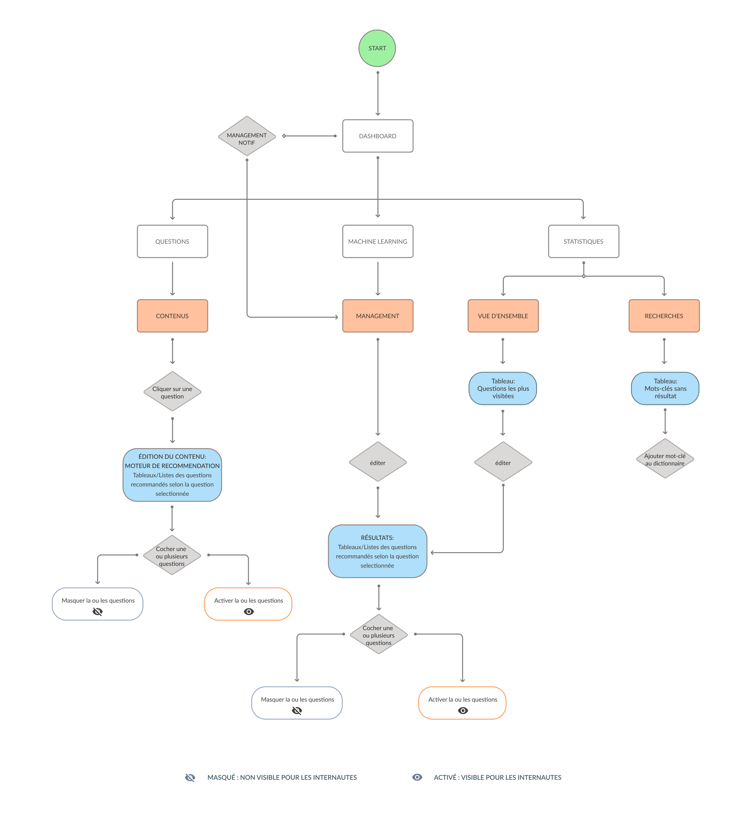
User flow
The UX process began by defining user flows tailored to key roles:
Customer Service Manager to optimise FAQs
Knowledge Manager to create and edit content
The Analyst to view statistics
Key user flows
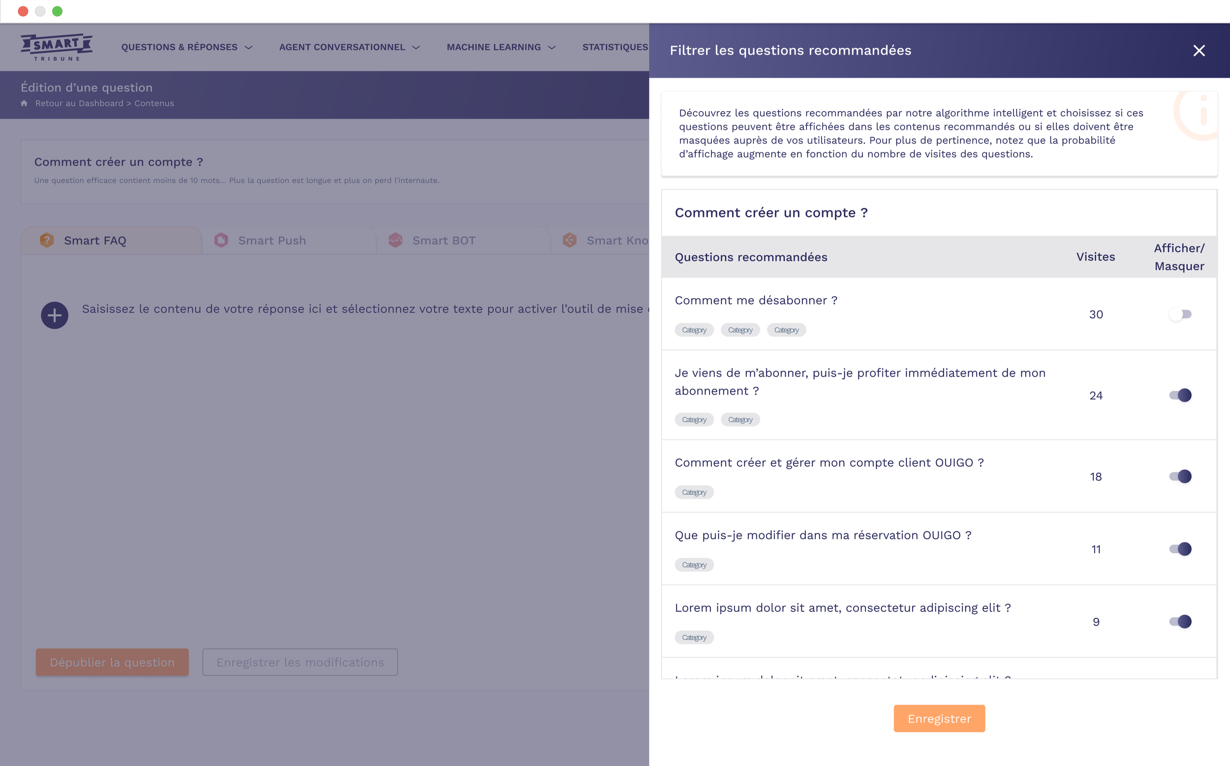
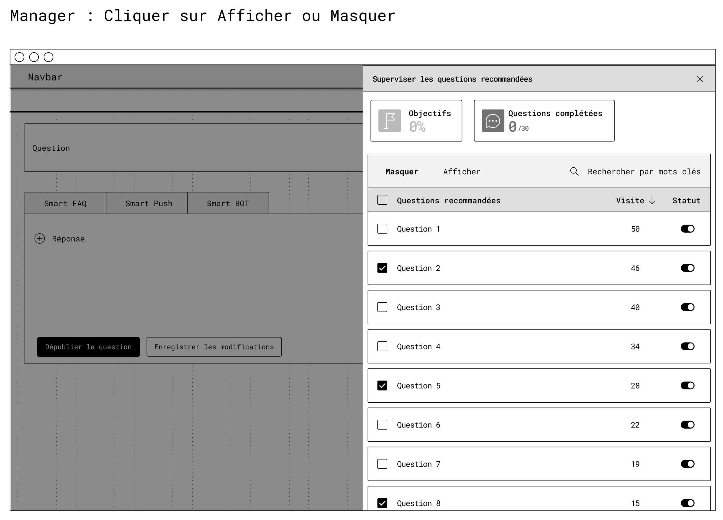
Management from a question:
The manager opens a question in the back office, accesses the ‘Supervise recommended questions’ side panel, searches or filters questions, ticks one or more lines, then chooses to display or hide before saving the changes.
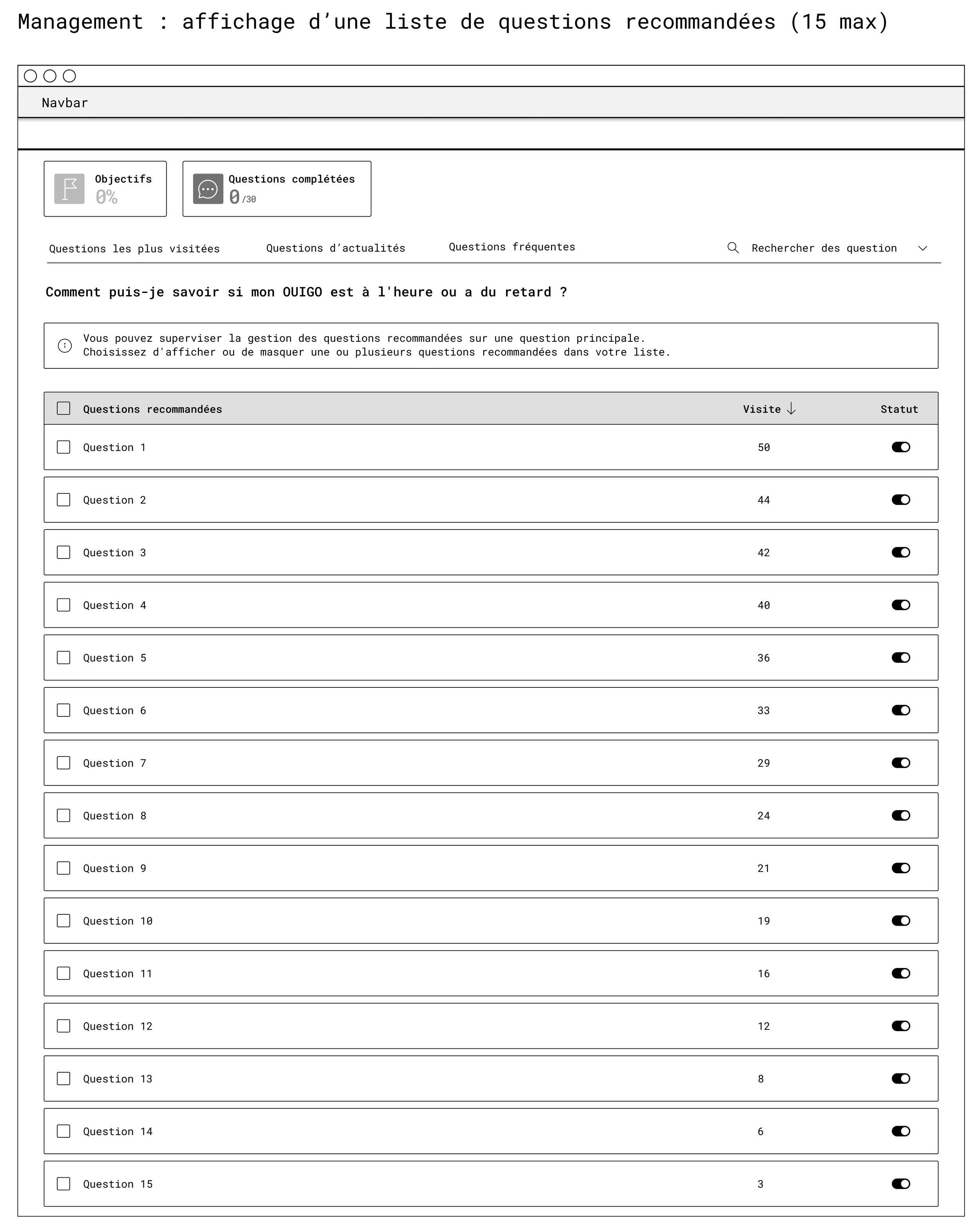
Recommendation list view:
From the Machine learning section, the manager views a list of recommended questions (up to 15), sorted by visits, adjusts statuses using toggles or multiple selection, then validates the changes.
Wireframing and interaction patterns
Wireframes were then developed to structure the back office, mapping access flows, navigation hierarchies and essential interactions, validated by iterations based on internal feedback.
This approach made it possible to align features with actual needs, prioritising an intuitive and scalable interface.
First wireframe : Management
It defines the list of recommended questions on the machine learning page:
Clear table with columns for ‘Question’, “Visits” and ‘Status’
Checkboxes for bulk actions
Help message at the top to explain the supervision logic.
Second wireframe : manager
This illustrates the side panel on a question editing page:
Context tabs (Smart FAQ, Smart Push, Smart BOT)
Main content area on the left
Recommendation management panel on the right, allowing the response to be edited while managing related content in the same place.
UI Phase
Mockups
The UI mockups were designed to offer a streamlined interface with clear toggles to activate/hide content, role-specific dashboards (e.g., FAQ view for customer service, rich editor for knowledge managers), and interactive statistics visualisations.
Prototypes
High-fidelity prototypes incorporated elements such as dynamic filters and real-time previews, tested to ensure optimal usability on desktop. These designs emphasised visual clarity and responsiveness, facilitating rapid adoption.

Results & Impact
Successful deployment with:
concrete metrics
Positive feedback from internal users on ease of use
Strong user-centred design for hybrid systems (automation vs human)
More relevant recommendations for end users
By giving administrators the ability to hide inappropriate content and keep only the most useful content, the recommendations associated with each piece of content become more consistent and targeted.
Increased efficiency for internal teams
The back office becomes a real management tool, rather than just a technical configuration interface.
Customer service and knowledge management teams can adjust recommendations without going through the tech team, which reduces back-and-forth communication and speeds up content updates.
Overall quality of the knowledge base
By gradually cleaning up poor-performing recommendations, the system learns what works and what doesn't, and the content base becomes clearer.
This limits the duplication of questions, highlights reference content, and indirectly improves indicators such as the self-resolution rate.
Keep reading
More examples of design that drives results.