

-
The current Design System suffers from major structural shortcomings that directly impact the speed and quality of product deliveries. Fragmented and outdated documentation creates a communication gap between Product (designers) and Tech (developers) teams, leading to misunderstandings and inconsistencies in the interface.
-
1. Lack of token architecture
Tokens (colours, spacing, fonts) were virtually non-existent or unused in Figma.
No structured organisation: No clear hierarchy between the different token levels.
Impossible to maintain: Each change required multiple manual interventions in the mock-ups.
2. Inadequate documentation
Scattered information: No single source of truth for component specifications.
Lack of guidelines: No clear rules on when, where, and how to use components.
3. Operational consequences
Visual inconsistencies throughout the application
Development time extended by back-and-forth communication and clarifications
Frequent implementation errors due to lack of specifications
Complex onboarding for new team members

Implemented solution
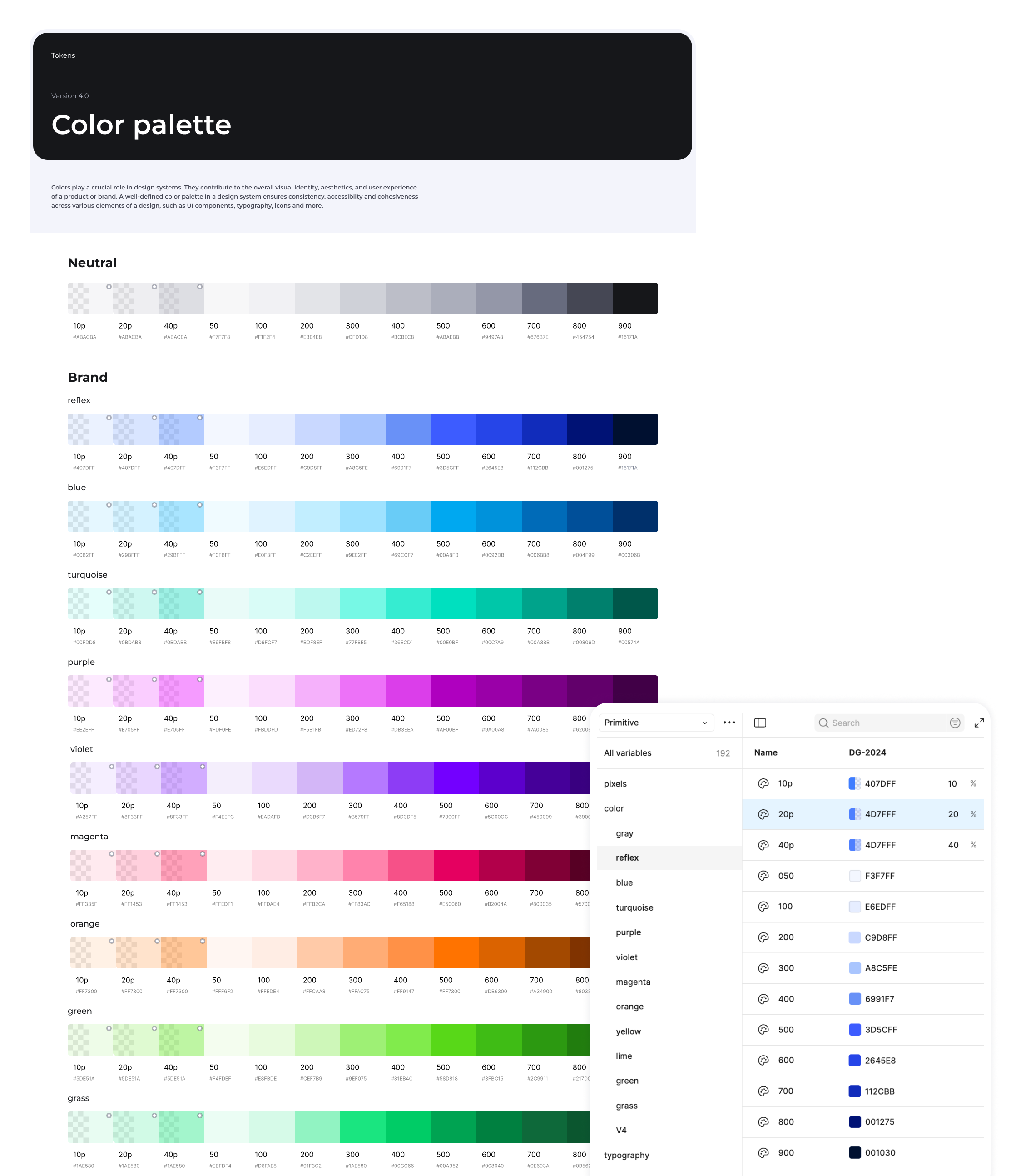
1. Three-level token architecture
To speak the language of developers and rigorously structure the system, we have adopted a cascading token architecture:
Primitive tokens
Basic, atomic and contextual values:
Raw colors (grey, reflex, blue, turquoise, purple, violet, magenta, orange, yellow, green, …)
Pixels(4px, 8px, 16px, etc.)
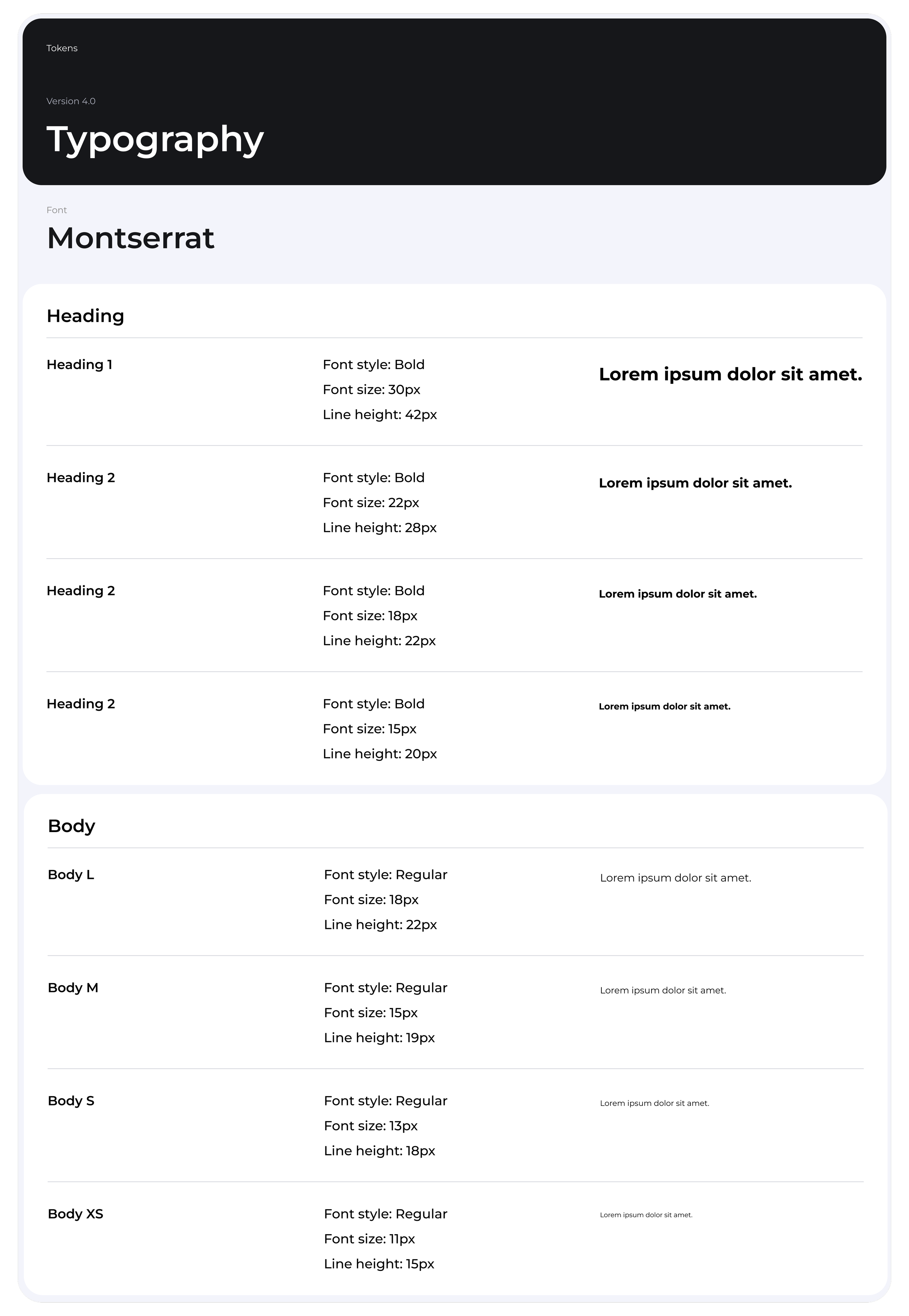
Typography (fontFace, fontWeight, FontSize, lineHeight)
Semantic Basic
Tokens with business , referencing primitives:
Color / Radius / Padding / Gap / Icon size / Border / Modules
Component tokens
Tokens specific to each component, eg:
Buttons / Checkboxes / Input / Attributes / Message / Modale / Filter / Tags / Tabs
Advantages of this approach
Maximum flexibility
Quick adjustments in Figma on mock-ups.
Simplified maintenance
Only one variable file to maintain.
Cascading changes
Modifying a primitive automatically affects all components.
Guaranteed consistency
Impossible to use a value outside the system.
2. Complete technical documentation in Notion
We have created a Design System Hub on Notion that centralises all technical documentation, structured according to developers' needs:
Component documentation structure
For example, for each component (e.g. Buttons), the documentation includes:
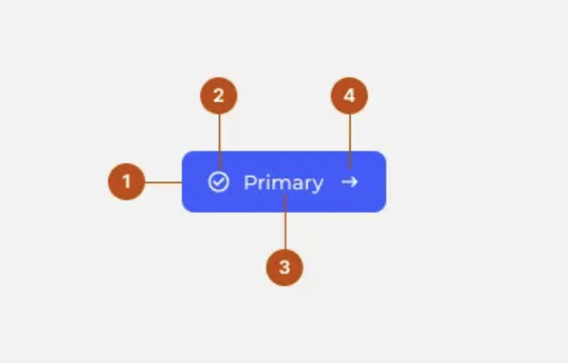
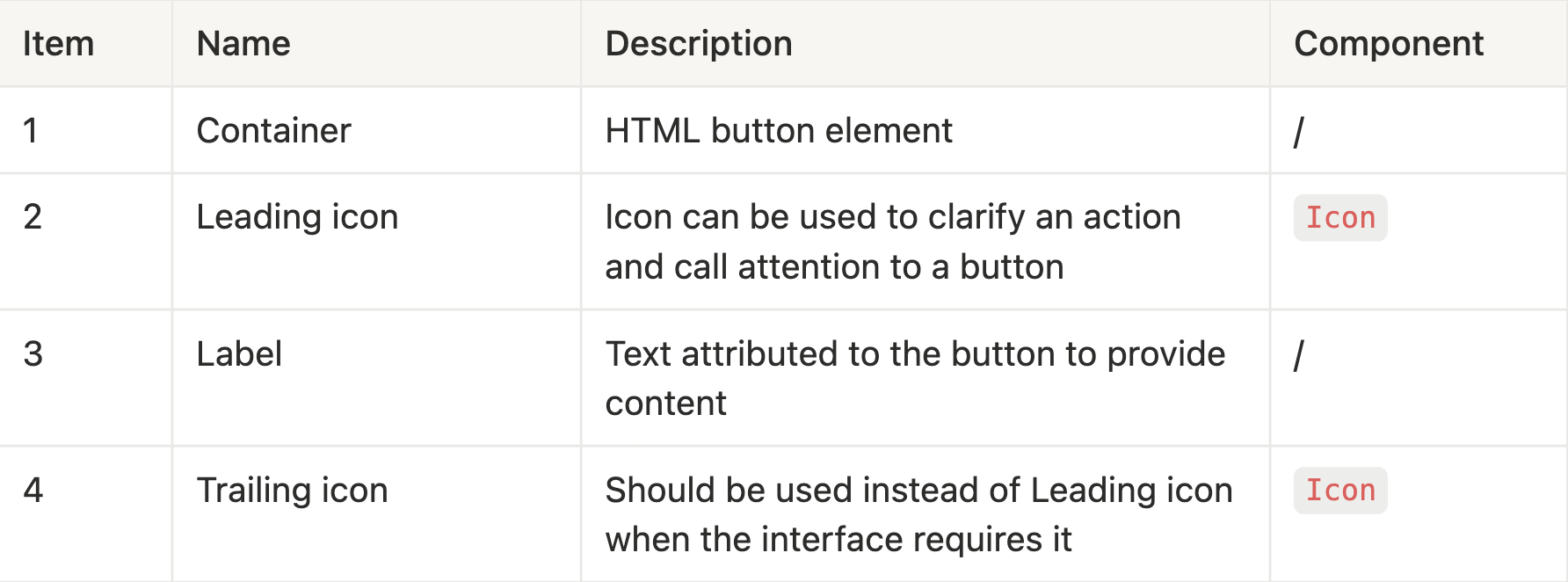
Technical specifications
Detailed anatomy of the component
Tokens used (colours, spacing, typography)
Code snippets and implementation examples
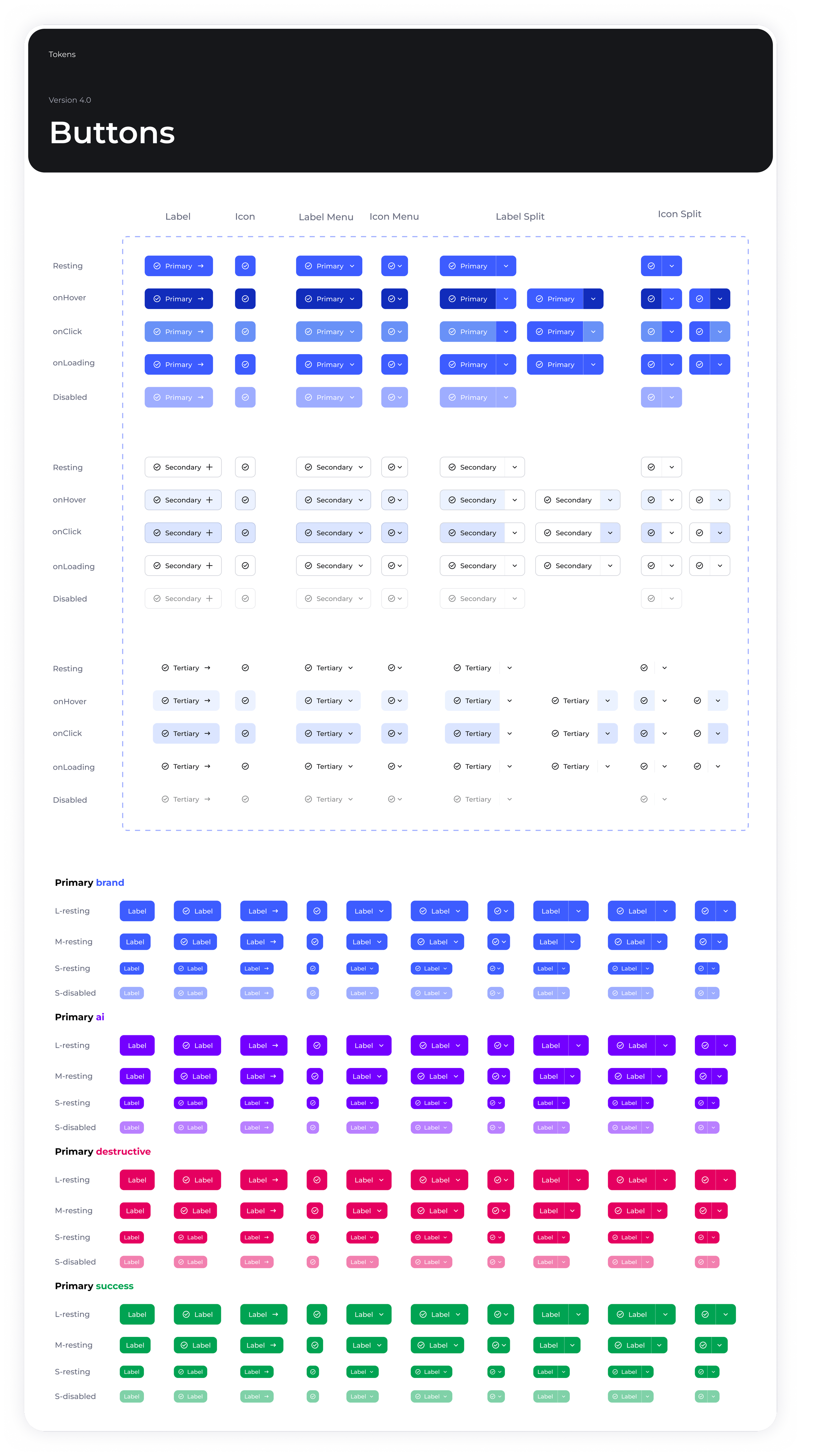
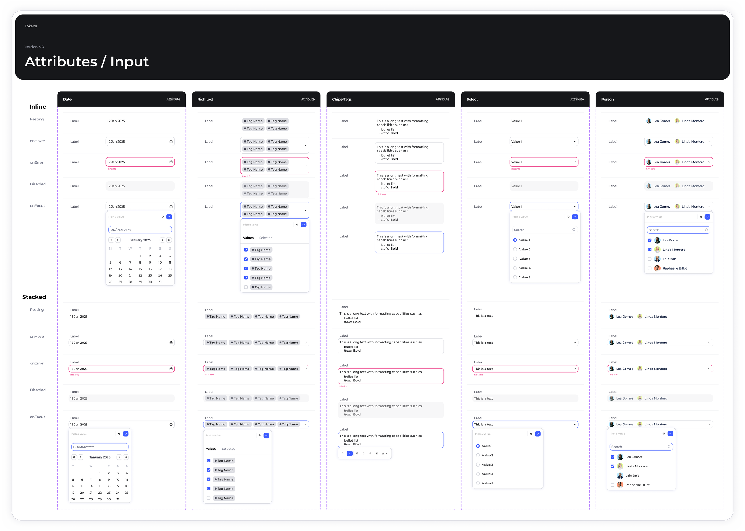
Variants and states
States: Resting, Hover, Active, Focus, Loading, Disabled
Types: Primary, Secondary, Tertiary, Ghost
Sizes: Small, Medium, Large
Usage guidelines
When to use it: Appropriate application contexts
When not to use it: Cases where another component is preferable
Hierarchy of actions (primary for the main action, secondary for secondary actions)
Behaviour
Click and hover interactions
Loading state management
Accessibility (keyboard navigation, focus management)
Responsive behaviour
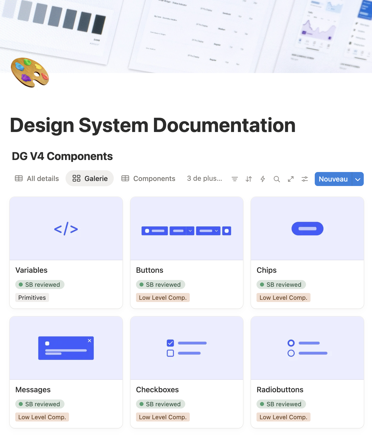
This documentation becomes the single reference for all developers, eliminating ambiguities and misinterpretations.
3. Optimised collaboration workflow
Component creation process
Design phase
The designer creates the component in Figma using tokens.
Complete documentation in Notion (specs, variants, usage).
The ticket is assigned to the developer with a link to the documentation.
Development phase
The developer implements according to the exact specifications.
Strict use of Design System tokens.
Code review including DS compliance
Validation phase: acceptance testing
Collaborative acceptance testing: The designer and developer meet
Point-by-point verification
Compliance with design guidelines
Compliant interactive behaviours
Correctly implemented states and variants
Validated accessibility
Adjustments if necessary before merge

Benefits of this workflow
Zero ambiguity
Comprehensive documentation before development
Figma file always up to date
Permanent design/code synchronisation
Guaranteed quality
Systematic validation before delivery
Fewer back-and-forths
Fewer design bugs in QA
Shared knowledge
Acceptance testing creates a common understanding
Design System eg.
Analyze impact
The new Access Control Management introduced an ABAC model and a group-based factorization that drastically simplified permission handling.
Rules are now centralized and reusable, allowing admins to manage access for multiple teams and modules from a single place.
This redesign brought clarity, consistency, and stronger security — users only see what’s relevant to them, while admins gain a global and auditable view of all permissions.
Up to 80 %
fewer repetitive configurations, instant rule propagation across modules, and a significant drop in access-related support tickets.
Business & User Outcomes
Drastic reduction of configuration errors and support tickets related to access issues.
Empowerment of workspace admins, who can now independently manage permissions without technical support
100 % of clients
adopted the new permission management system within weeks.
Keep reading
More examples of design that drives results.